Responsive Table
A mobile-friendly table solution, which persists headers for each table-cell on mobile devices.
I took a stab at a responsive table during a recent hackathon project. It turned out pretty well, so I thought I’d share.
tl;dr: Here’s the demo and code:

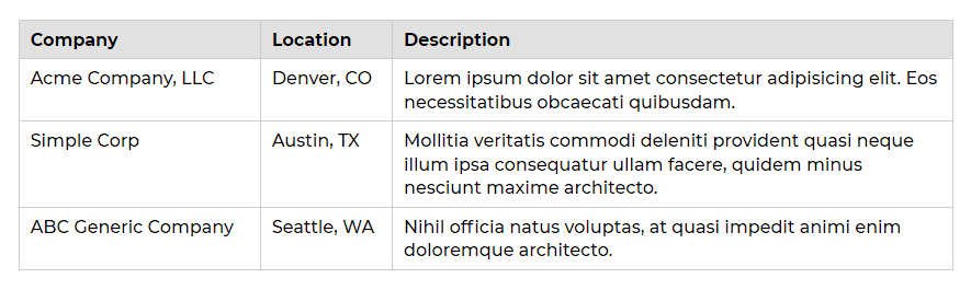
Here’s a typical data table with column headers at the top and rows below.
On mobile devices the orientation changes from horizontal to vertical, and each cell is prepended with its respective table header as a label.

I was going for a really clean look where labels and cells would line up with the previous row, but I also wanted it to be fluid, so I could just plug it into any site without having to adjust widths in the future.
There are a few things at play here:
- A Class: The JavaScript is scoped by
.js-table-datawhich needs to be included on<table>. This will keep it from messing with any other tables you may have, or just remove that class from the js if you want it to apply to every table on your site. - Some CSS: I used a hack I previously wrote about to add a pseudo element displayed as a table-cell, which tricks the remaining part of the element to behave like a separate table-cell, as long as the original element is displayed as a table-row. It’s confusing, but the code and live example should help.
- A Media Query: I know there’s a lot of dogma about mobile-first CSS … but I used a
max-widthmedia query to keep things simple. The alternative is overwriting a lot of values for the desktop which seems unnecessary. - Dash of JavaScript: The js adds data attributes, which contain the header text, to each table-cell. I used jQuery methods, so don’t forget to include the library. Alternatively, you can pull this off with CSS alone, which I discuss at the end of this post. However, the js makes it very easy to add this to any website, with multiple tables, and still works [within reason] if a content editor adds or pastes a table.
Demo on CodePen
See the Pen Mobile Friendly Table by Jeremy Church (@jeremychurch) on CodePen.
HTML
<table class='js-table-data'>
  <thead>
    <tr>
      <th>Company</th>
      <th>Location</th>
      <th data-label='Desc'>Description</th>
    </tr>
  </thead>
  <tr>
    <td>Acme Company, LLC</td>
    <td>Denver, CO</td>
    <td>Lorem ipsum dolor sit amet consectetur adipisicing elit. Eos necessitatibus obcaecati quibusdam.</td>
  </tr>
</table>
CSS
@media screen and (max-width: 767px) {
  thead { display: none; }
  tr {
    display: block;
    position: relative;
    padding: 1.2em 0; }
  tr:first-of-type { border-top: 1px solid #ccc; }
  td { display: table-row; }
  td:before {
    content: attr(data-label);
    display: table-cell;
    font-weight: bold;
    padding: 0.2em 0.6em 0.2em 0;
    text-align: right; }
  td:last-child:after {
    content: "";
    position: absolute;
    left: 0;
    right: 0;
    bottom: 0;
    border-bottom: 1px solid #ccc; }
}
JavaScript
$(document).ready(function(){
  $('.js-table-data').each(function(){
    table = $(this);
    tableRow = table.find('tr');
    table.find('td').each(function(){
      tdIndex = $(this).index();
      if ($(tableRow).find('th').eq(tdIndex).attr('data-label')){
        thText = $(tableRow).find('th').eq(tdIndex).data('label');
      } else {
        thText = $(tableRow).find('th').eq(tdIndex).text();
      }
      $(this).attr('data-label', thText + ':');
    });
  });
});
Not sure how to include JavaScript?
Save the above JavaScript to a file (e.g. responsive-table.js), then add the following to your HTML just before the closing </body> tag (includes jQuery library as well).
<script src='https://ajax.googleapis.com/ajax/libs/jquery/3.3.1/jquery.min.js'></script>
<script src='responsive-table.js'></script>

</body>
Different Headers for Mobile
If you need to modify a header on mobile devices for whatever reason (e.g. “Description” could be shortened to “Desc”), you can manually add data-label to a specific <th>, and the JavaScript will grab that instead of the inner text.
<th data-label='Desc'>Description</th>CSS-Only Solution
You may not need to include the JavaScript. If your table rows are generated within a loop, AND you don’t have a lot of different tables with different headers, then you can manually add the data attributes to each <td> within the loop, and omit the JavaScript.
<td data-label='Name'>Name</td>Potential issues for CSS-only solution:
- Not plug-n-play on every site and new projects.
- If the table rows aren’t in a loop, then you’ll have to add the data attrs to each cell in every row.
- You might update table headers, then forget to update data attrs on table cells.
- If a content editor needs to add a table, it’s probably too much to expect them to edit the code and add data attrs to every cell.