Flexbox for Mobile Content
Flexbox may not be necessary on the desktop, but it’s handy for reflowing content on mobile devices.
When it comes to basic columns, flexbox might be overkill in favor of floats. Floats are a known quantity; well supported and reliable. But when switching from columns to rows on a mobile device, the content order doesn’t always make sense.
With flexbox, the order of content isn’t dictated by the markup. Instead content can be organized based on its priority. And flexbox is supported quite well in the current default iOS, Andriod and Blackberry browsers.


Floated columns become flexbox rows.
<div class="cols">
  <div class="col_one_third media_xs_order_two">
    [sidebar]
  </div>
  <div class="col_two_thirds media_xs_order_one">
    [main]
  </div>
</div>
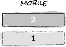
Using a simple HTML structure and media query, we can change the CSS from floated columns to flexbox rows. Content is ordered by adding modular classes(e.g. media_xs_order_one) which can be reused throughout a site.
The example below demonstrates the effect. Columns switch to rows at a specified media query, and the order changes independent of the markup.
See the Pen mhpKC by Jeremy Church (@jeremychurch) on CodePen.1457
Try resizing the browser or viewing on a mobile device.
Flexbox requires a parent container. So, if you currently nest columns in a container, you should be able to implement this technique with your current markup.
This method supports IE8, because it ignores media queries which is where I defined flexbox. If you’re not worried about IE8, and prefer a mobile first approach, you can scope the floated columns by min-width instead of defining flexbox under max-width.
Conclusion
I wasn’t sure how this approach would fare in the wild, but I’ve had a good deal of success with it on a handful of sites over the last six months. ∎