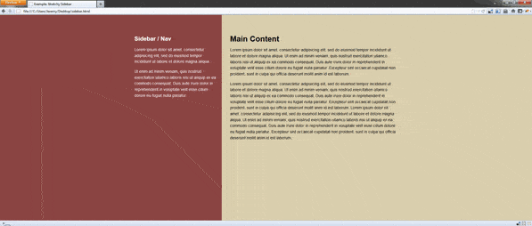
Stretchy Sidebar

I couldn’t think of a good name to convey this concept, so I went with an alliteration. Basically we want to split the page in two, so the sidebar color extends or fits the page. Here’s a few ways to create the effect.
Repeating background image
Using a repeating background image is simple and should work in every browser. The drawback; it’s an image, so if the colors change we have to update the image.
For the body background we need to create an image that’s half the first color and half the second color(50/50). To cover wide resolutions and hi-res displays in the future, I made my image 3500 x 1.
A closeup of the background image
html {
    height: 100%;
    }
body {
    margin: 0;
    padding: 0;
    height: 100%;
    background: url('bg_body.gif') top center;
    }
#container {
    margin: 0 auto;
    width: 950px;
    height: 100%;
    }
#main {
    float: left;
    padding-left: 30px;
    width: 605px;
    height: 100%;
    background: #D9CEAD;
    }
#sidebar {
    float: left;
    padding-right: 20px;
    width: 295px;
    color: #fff;
    }
<div id="container">
<div id="sidebar">
<!-- insert sidebar content -->
</div>
<div id="main">
<!-- insert main content -->
</div>
</div>Alternate background image method
We could create a background image with the actual column widths, which means we wouldn’t need to specify the background color for the columns. However, we lose the ability to scale the column widths without updating the background image. With that said, I won’t go into the details here, but give it a whirl and see which works for you.
Gradient background (experimental)
This method offers the most flexibility. Unfortunately it’s not going to work in IE6-9, because they don’t support gradient stops. For now it’s just for fun.
Everything is identical to the previous example, except we just replace the background image with a gradient:
body {
    margin: 0;
    padding: 0;
    height: 100%;
    background: #D9CEAD; /* Fall back */
    background: -moz-linear-gradient(left, #8A4442 0%,
                #8A4442 50%, #D9CEAD 51%, #D9CEAD 100%);
    background: -webkit-linear-gradient(left, #8A4442 0%,
                #8A4442 50%,#D9CEAD 51%,#D9CEAD 100%);
    background: -o-linear-gradient(left, #8A4442 0%,
                #8A4442 50%,#D9CEAD 51%,#D9CEAD 100%);
    background: -ms-linear-gradient(left, #8A4442 0%,
                #8A4442 50%,#D9CEAD 51%,#D9CEAD 100%);
    background: linear-gradient(left, #8A4442 0%,
                #8A4442 50%,#D9CEAD 51%,#D9CEAD 100%);
    }
Related resources
- CSS gradient generator by ColorZilla